
A blog article from the Pandora Insights blog hooked me with a simple infographic that appeared in my LinkedIn newsfeed. In addition to the infographics being well-designed and expressive (which I’ll get to in a minute), the article itself was solidly built, and more informative than a typical self-promotional article.
This blog gets it right on so many counts that it provides an easy-to-follow example that can help you make your own company or personal blog more than just a parking lot of text.
View our Prezi fly-through below!
A Tightly-Structured Quick Read
Pandora’s blog is targeted to B2B marketers, and this article’s headline, “Why ‘Addressable Audience’ Should Matter To Marketers”, is immediately relevant to that audience; it raises a question relevant to marketers and advertisers.
The article is a tightly-structured quick read: The introduction is only two short paragraphs. The first section explains the core concept the article addresses, and then illustrates its platform’s superiority. The second section directs the reader to prescriptive action. The third section provides a 3-step how-to. Each step is only two sentences at most. This may seem scant, but it is sufficient. For good measure, a one-paragraph case study includes high-level ROI metrics, and a link to a full-length case study. Finally, there is a list of data sources, and below that, a clear call to action. The self-promotion is blatant, but there’s enough actual information here that I don’t feel put off by it.
Data-Rich Infographics Delight And Deliver
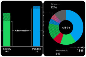
The article features real data from third party sources that clearly favors Pandora’s brand over its major competitor, Spotify. The infographics are exciting, even when viewed at the reduced sizes you first see when the article is shared on social media newsfeeds. The infographics don’t show every conceivable factoid. Some of those are left in the text. This allows every element of the infographic to aid the article’s overall message.
The two infographics are given black backgrounds. This is a great design choice because the blog theme already has a lot of whitespace, and this sharp contrast keeps the data from being swallowed up in it.
These designs required a lot of negative space for all of the labels to be legible. The labels and quantities could not fit into the spaces of the data series themselves, so they were pushed to the margins and sized to be read. These are informed design choices.
Each infographic is a basic chart type, but each does something that doesn’t come out of a wizard. Each required some manipulation. A lot more is possible when infographics are created using a tool with more fine-grained control than even Microsoft Excel offers.
The column chart is actually a hybrid of a stacked-column chart and a paired column chart. The stacked column chart shows two data points and their sum for Pandora and its biggest rival, Spotify. These three values can be compared side by side. Solid-colored blocks are more substantial than the patterned filled blocks. The Pandora column uses Pandora’s brand color to emphasize its importance, and increase contrast between the two brands. The chart title highlights the most important conclusion. The “Addressable” label in the center highlights the most important comparison. If the word “Audience” were added to this label, this infographic could circulate independent of the blog article.
The donut chart uses the patterned and solid fills again to show commonality among a group of adjacent sections with different colors. Unfortunately, the patterned fill is too fine to easily observe. This can affect readability at shrunken sizes. The extensive labels make the legend in the lower-right corner superfluous.
Making The Sale: Is This A Blog Post Or A Landing Page?
Though it provides a button so that a user can view other articles, Pandora’s Insights blog really functions as a landing page. The headline and “Contact Us” button below it make up the call to action, to get a demo. (The button takes the visitor to a web form.) This blog’s user experience design limits the actions a user can take on the blog page. Because of the buttons, each navigation away from this page can be tracked.
In conclusion, the article has an interesting angle, a relevant topic, a strong point of view, and spare text. Its intriguing and elegant infographics are thoughtfully designed and on message. They balance out the text. I come away feeling informed enough to make my own decision instead of feeling marketed to.
Put thought into creating infographics that support your latest project boasts. Reconsider your blog’s layout, and see if it might be able to make your articles work more like highly informative landing pages.
Are you attending the ArchitectureBoston Expo (ABX) and GREENBUILD 2017 in November? Don’t miss our educational session all about infographics, “Leveraging Data and Graphics To Make Your Long Story Short” on Wednesday, November 8th. Register for session WE-31 here